Background
THREE Insurance is one of Berkshire Hathaway’s commercial insurance brands catered to small business insurance. THREE aims to provide comprehensive coverage to small-business owners need in just a single, three-page policy — hence the brand name.
The Problem
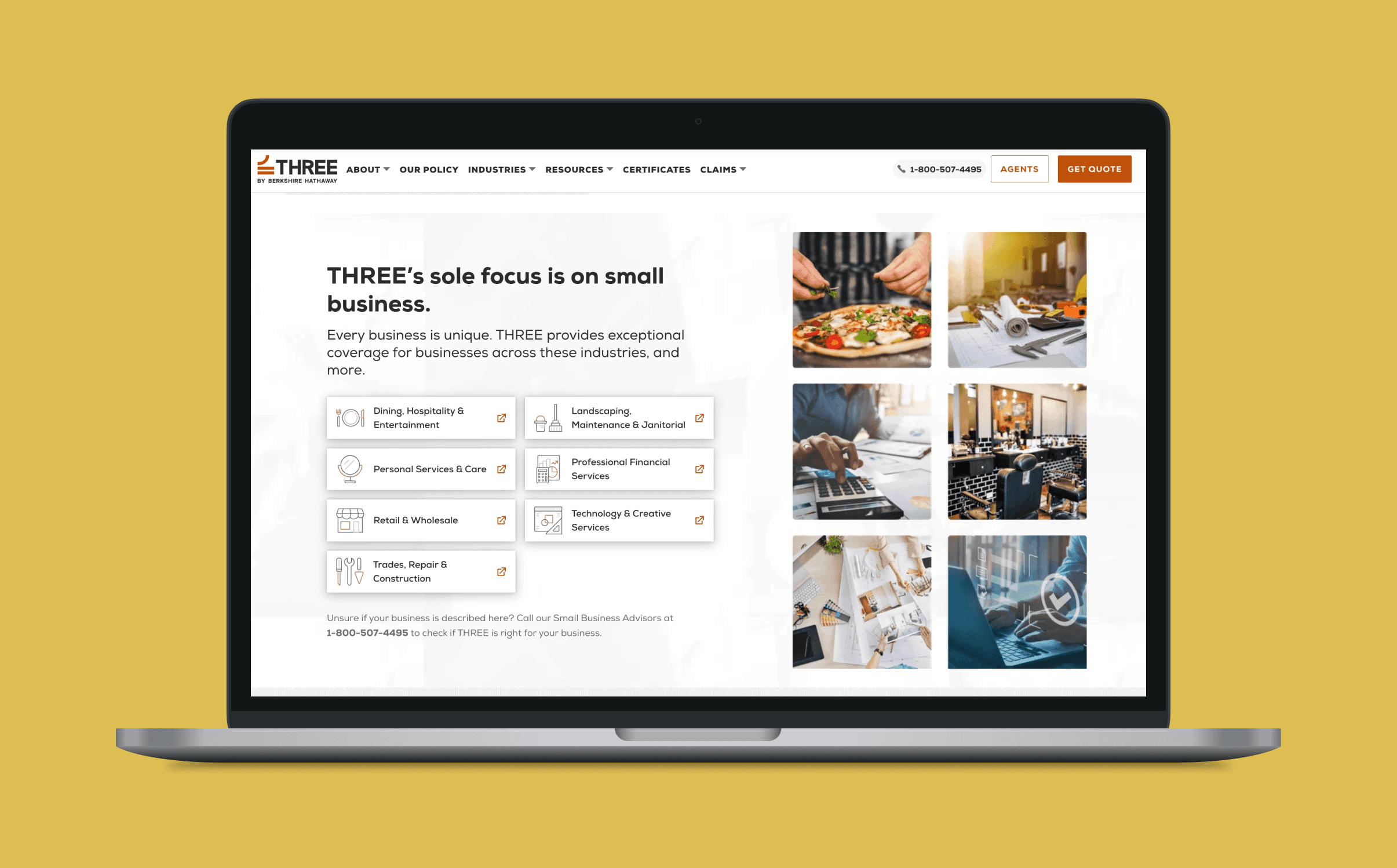
THREE's website includes a section with a list of industries that their business insurance covers. Their previous design didn't quite make it clear for users that these industry sections had clickable links to pages with more information.
Website audit & design concepting
As the lead designer for this effort, my task was to redesign the industry section in a way that made it more clear that, once clicked, the pop-up content was clickable and provided more information for users seeking business insurance in those industries.
To solve for this challenge, I audited the THREE Insurance site to see what their latest styles of CTAs consisted of in order to ensure the use of up-to-date designs, as well as analyzing how their competitors were handling similar content on their sites.
From there, I provided the client with a few options to choose from, including reasoning as to what makes them work and how they may be lacking.
Approved Design
The client approved a final design that included the use of eye-catching imagery, as well as made it clear that users can navigate pages with more informational content. Not only does this design include clear distinctions with 'Learn More' CTA buttons, but with the inclusion of hyperlinks and iconography in the header image as well.